
 568k
568k  233k
233k  41k
41k  Subscribe
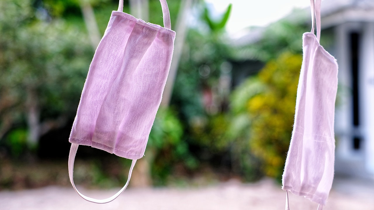
Cloth Masks Do Protect the Wearer – Breathing in Less Coronavirus Means You Get Less Sick
Surakiet Ampun / EyeEm / Getty Images
By Monica Gandhi
Masks slow the spread of SARS-CoV-2 by reducing how much infected people spray the virus into the environment around them when they cough or talk. Evidence from laboratory experiments, hospitals and whole countries show that masks work, and the Centers for Disease Control and Prevention recommends face coverings for the U.S. public. With all this evidence, mask wearing has become the norm in many places.
I am an infectious disease doctor and a professor of medicine at the University of California, San Francisco. As governments and workplaces began to recommend or mandate mask wearing, my colleagues and I noticed an interesting trend. In places where most people wore masks, those who did get infected seemed dramatically less likely to get severely ill compared to places with less mask-wearing.
It seems people get less sick if they wear a mask.
When you wear a mask – even a cloth mask – you typically are exposed to a lower dose of the coronavirus than if you didn’t. Both recent experiments in animal models using coronavirus and nearly a hundred years of viral research show that lower viral doses usually means less severe disease.
No mask is perfect, and wearing one might not prevent you from getting infected. But it might be the difference between a case of COVID-19 that sends you to the hospital and a case so mild you don’t even realize you’re infected.
Exposure Dose Determines Severity of Disease
When you breathe in a respiratory virus, it immediately begins hijacking any cells it lands near to turn them into virus production machines. The immune system tries to stop this process to halt the spread of the virus.
The amount of virus that you’re exposed to – called the viral inoculum, or dose – has a lot to do with how sick you get. If the exposure dose is very high, the immune response can become overwhelmed. Between the virus taking over huge numbers of cells and the immune system’s drastic efforts to contain the infection, a lot of damage is done to the body and a person can become very sick.
On the other hand, if the initial dose of the virus is small, the immune system is able to contain the virus with less drastic measures. If this happens, the person experiences fewer symptoms, if any.
This concept of viral dose being related to disease severity has been around for almost a century. Many animal studies have shown that the higher the dose of a virus you give an animal, the more sick it becomes. In 2015, researchers tested this concept in human volunteers using a nonlethal flu virus and found the same result. The higher the flu virus dose given to the volunteers, the sicker they became.
In July, researchers published a paper showing that viral dose was related to disease severity in hamsters exposed to the coronavirus. Hamsters who were given a higher viral dose got more sick than hamsters given a lower dose.
Based on this body of research, it seems very likely that if you are exposed to SARS-CoV-2, the lower the dose, the less sick you will get.
So what can a person do to lower the exposure dose?
Masks Reduce Viral Dose
Most infectious disease researchers and epidemiologists believe that the coronavirus is mostly spread by airborne droplets and, to a lesser extent, tiny aerosols. Research shows that both cloth and surgical masks can block the majority of particles that could contain SARS-CoV-2. While no mask is perfect, the goal is not to block all of the virus, but simply reduce the amount that you might inhale. Almost any mask will successfully block some amount.
Laboratory experiments have shown that good cloth masks and surgical masks could block at least 80% of viral particles from entering your nose and mouth. Those particles and other contaminants will get trapped in the fibers of the mask, so the CDC recommends washing your cloth mask after each use if possible.
The final piece of experimental evidence showing that masks reduce viral dose comes from another hamster experiment. Hamsters were divided into an unmasked group and a masked group by placing surgical mask material over the pipes that brought air into the cages of the masked group. Hamsters infected with the coronavirus were placed in cages next to the masked and unmasked hamsters, and air was pumped from the infected cages into the cages with uninfected hamsters.
As expected, the masked hamsters were less likely to get infected with COVID-19. But when some of the masked hamsters did get infected, they had more mild disease than the unmasked hamsters.
Masks Increase Rate of Asymptomatic Cases
In July, the CDC estimated that around 40% of people infected with SARS-CoV-2 are asymptomatic, and a number of other studies have confirmed this number.
However, in places where everyone wears masks, the rate of asymptomatic infection seems to be much higher. In an outbreak on an Australian cruise ship called the Greg Mortimer in late March, the passengers were all given surgical masks and the staff were given N95 masks after the first case of COVID-19 was identified. Mask usage was apparently very high, and even though 128 of the 217 passengers and staff eventually tested positive for the coronavirus, 81% of the infected people remained asymptomatic.
Further evidence has come from two more recent outbreaks, the first at a seafood processing plant in Oregon and the second at a chicken processing plant in Arkansas. In both places, the workers were provided masks and required to wear them at all times. In the outbreaks from both plants, nearly 95% of infected people were asymptomatic.
There is no doubt that universal mask wearing slows the spread of the coronavirus. My colleagues and I believe that evidence from laboratory experiments, case studies like the cruise ship and food processing plant outbreaks and long-known biological principles make a strong case that masks protect the wearer too.
The goal of any tool to fight this pandemic is to slow the spread of the virus and save lives. Universal masking will do both.
Monica Gandh is a Professor of Medicine, Division of HIV, Infectious Diseases and Global Medicine at the University of California, San Francisco.
Disclosure statement: Monica Gandhi does not work for, consult, own shares in or receive funding from any company or organization that would benefit from this article, and has disclosed no relevant affiliations beyond their academic appointment.
Reposted with permission from The Conversation.