Earth May Temporarily Pass Dangerous 1.5℃ Warming Limit by 2024, Major New Report Finds

By Pep Canadell and Rob Jackson
The Paris climate agreement seeks to limit global warming to 1.5℃ this century. A new report by the World Meteorological Organization warns this limit may be exceeded by 2024 – and the risk is growing.
This first overshoot beyond 1.5℃ would be temporary, likely aided by a major climate anomaly such as an El Niño weather pattern. However, it casts new doubt on whether Earth's climate can be permanently stabilized at 1.5℃ warming.
This finding is among those just published in a report titled United in Science. We contributed to the report, which was prepared by six leading science agencies, including the Global Carbon Project.
The report also found while greenhouse gas emissions declined slightly in 2020 due to the COVID-19 pandemic, they remained very high – which meant atmospheric carbon dioxide concentrations have continued to rise.
Greenhouse Gases Rise as CO₂ Emissions Slow
Concentrations of the three main greenhouse gases – carbon dioxide (CO₂), methane (CH₄) and nitrous oxide (N₂O), have all increased over the past decade. Current concentrations in the atmosphere are, respectively, 147%, 259% and 123% of those present before the industrial era began in 1750.
Concentrations measured at Hawaii's Mauna Loa Observatory and at Australia's Cape Grim station in Tasmania show concentrations continued to increase in 2019 and 2020. In particular, CO₂ concentrations reached 414.38 and 410.04 parts per million in July this year, respectively, at each station.
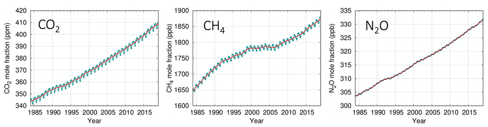
Atmospheric concentrations of carbon dioxide (CO₂), methane (CH₄) and nitrous oxide (N₂0) from WMO Global Atmosphere Watch.
Growth in CO₂ emissions from fossil fuel use slowed to around 1% per year in the past decade, down from 3% during the 2000s. An unprecedented decline is expected in 2020, due to the COVID-19 economic slowdown. Daily CO₂ fossil fuel emissions declined by 17% in early April at the peak of global confinement policies, compared with the previous year. But by early June they had recovered to a 5% decline.
We estimate a decline for 2020 of about 4-7% compared to 2019 levels, depending on how the pandemic plays out.
Although emissions will fall slightly, atmospheric CO₂ concentrations will still reach another record high this year. This is because we're still adding large amounts of CO₂ to the atmosphere.
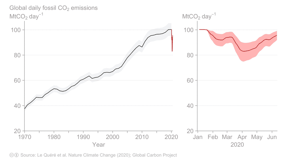
Global daily fossil CO₂ emissions to June 2020. Updated from Le Quéré et al. 2020, Nature Climate Change.
Warmest Five Years on Record
The global average surface temperature from 2016 to 2020 will be among the warmest of any equivalent period on record, and about 0.24℃ warmer than the previous five years.
This five-year period is on the way to creating a new temperature record across much of the world, including Australia, southern Africa, much of Europe, the Middle East and northern Asia, areas of South America and parts of the United States.
Sea levels rose by 3.2 millimeters per year on average over the past 27 years. The growth is accelerating – sea level rose 4.8 millimeters annually over the past five years, compared to 4.1 millimeters annually for the five years before that.
The past five years have also seen many extreme events. These include record-breaking heatwaves in Europe, Cyclone Idai in Mozambique, major bushfires in Australia and elsewhere, prolonged drought in southern Africa and three North Atlantic hurricanes in 2017.
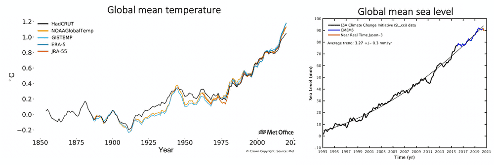
Left: Global average temperature anomalies (relative to pre-industrial) from 1854 to 2020 for five data sets. UK-MetOffice. Right: Average sea level for the period from 1993 to July 16, 2020. European Space Agency and Copernicus Marine Service.
1 in 4 Chance of Exceeding 1.5°C Warming
Our report predicts a continuing warming trend. There is a high probability that, everywhere on the planet, average temperatures in the next five years will be above the 1981-2010 average. Arctic warming is expected to be more than twice that the global average.
There's a one-in-four chance the global annual average temperature will exceed 1.5℃ above pre-industrial levels for at least one year over the next five years. The chance is relatively small, but still significant and growing. If a major climate anomaly, such as a strong El Niño, occurs in that period, the 1.5℃ threshold is more likely to be crossed. El Niño events generally bring warmer global temperatures.
Under the Paris Agreement, crossing the 1.5℃ threshold is measured over a 30-year average, not just one year. But every year above 1.5℃ warming would take us closer to exceeding the limit.
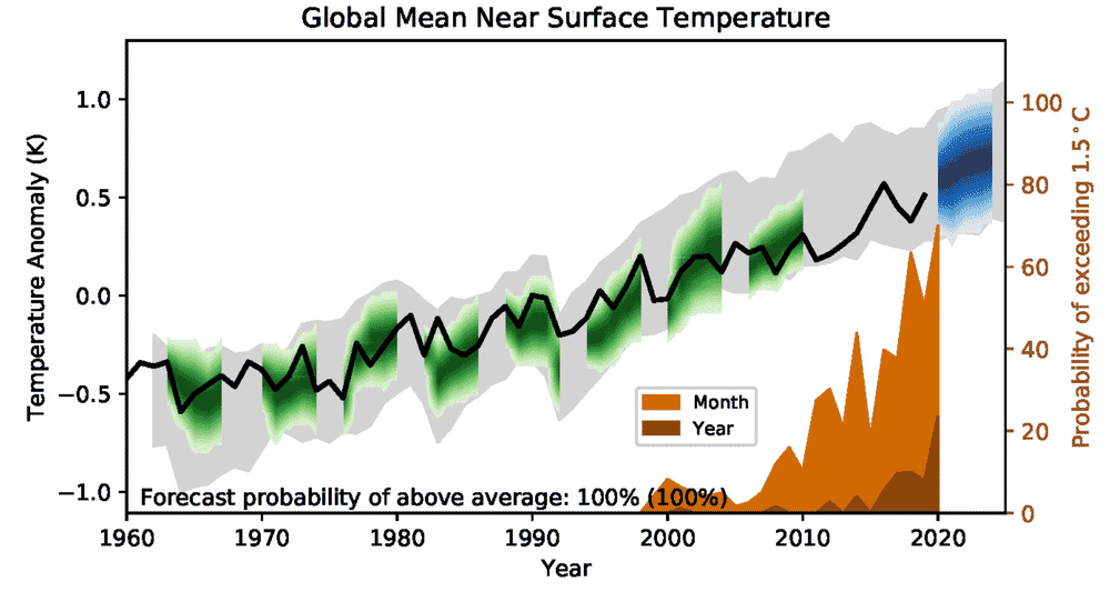
Global average model prediction of near surface air temperature relative to 1981–2010. Black line = observations, green = modelled, blue = forecast. Probability of global temperature exceeding 1.5℃ for a single month or year shown in brown insert and right axis. UK Met Office.
Arctic Ocean Sea-Ice Disappearing
Satellite records between 1979 and 2019 show sea ice in the Arctic summer declined at about 13% per decade, and this year reached its lowest July levels on record.
In Antarctica, summer sea ice reached its lowest and second-lowest extent in 2017 and 2018, respectively, and 2018 was also the second-lowest winter extent.
Most simulations show that by 2050, the Arctic Ocean will practically be free of sea ice for the first time. The fate of Antarctic sea ice is less certain.
Urgent Action Can Change Trends
Human activities emitted 42 billion tons of CO₂ in 2019 alone. Under the Paris Agreement, nations committed to reducing emissions by 2030.
But our report shows a shortfall of about 15 billion tons of CO₂ between these commitments, and pathways consistent with limiting warming to well below 2℃ (the less ambitious end of the Paris target). The gap increases to 32 billion tons for the more ambitious 1.5℃ goal.
Our report models a range of climate outcomes based on various socioeconomic and policy scenarios. It shows if emission reductions are large and sustained, we can still meet the Paris goals and avoid the most severe damage to the natural world, the economy and people. But worryingly, we also have time to make it far worse.
Pep Canadell is a Chief research scientist, Climate Science Centre, CSIRO Oceans and Atmosphere; and Executive Director, Global Carbon Project, CSIRO.
Rob Jackson is a Chair, Department of Earth System Science, and Chair of the Global Carbon Project, Stanford University.
Disclosure statement: Pep Canadell receives funding from the Australian National Environmental Science Program - Earth Systems and Climate Change hub. Rob Jackson receives funding from the Gordon and Betty Moore Foundation, California Energy Commission, Environmental Defense Fund, and Stanford Natural Gas Initiative.
Reposted with permission from The Conversation.
- Scientists Share Why Keeping Warming Under 1.5 Degrees Celsius ... ›
- Groundbreaking Study Shows Limiting Warming to 1.5 Degrees Is ... ›
- Tens of Thousands of Species at Risk if Warming Exceeds 1.5°C ... ›
A rare yellow penguin has been photographed for what is believed to be the first time.
- World-Renowned Photographer Documents Most Remote ... ›
- This Penguin Colony Has Fallen by 77% on Antarctic Islands ... ›
EcoWatch Daily Newsletter
By Stuart Braun
We spend 90% of our time in the buildings where we live and work, shop and conduct business, in the structures that keep us warm in winter and cool in summer.
But immense energy is required to source and manufacture building materials, to power construction sites, to maintain and renew the built environment. In 2019, building operations and construction activities together accounted for 38% of global energy-related CO2 emissions, the highest level ever recorded.
- Could IKEA's New Tiny House Help Fight the Climate Crisis ... ›
- Los Angeles City-Owned Buildings to Go 100% Carbon Free ... ›
- New Jersey Will Be First State to Require Building Permits to ... ›
Trending
By Eric Tate and Christopher Emrich
Disasters stemming from hazards like floods, wildfires, and disease often garner attention because of their extreme conditions and heavy societal impacts. Although the nature of the damage may vary, major disasters are alike in that socially vulnerable populations often experience the worst repercussions. For example, we saw this following Hurricanes Katrina and Harvey, each of which generated widespread physical damage and outsized impacts to low-income and minority survivors.
Mapping Social Vulnerability
<p>Figure 1a is a typical map of social vulnerability across the United States at the census tract level based on the Social Vulnerability Index (SoVI) algorithm of <a href="https://onlinelibrary.wiley.com/doi/abs/10.1111/1540-6237.8402002" target="_blank"><em>Cutter et al.</em></a> [2003]. Spatial representation of the index depicts high social vulnerability regionally in the Southwest, upper Great Plains, eastern Oklahoma, southern Texas, and southern Appalachia, among other places. With such a map, users can focus attention on select places and identify population characteristics associated with elevated vulnerabilities.</p>Fig. 1. (a) Social vulnerability across the United States at the census tract scale is mapped here following the Social Vulnerability Index (SoVI). Red and pink hues indicate high social vulnerability. (b) This bivariate map depicts social vulnerability (blue hues) and annualized per capita hazard losses (pink hues) for U.S. counties from 2010 to 2019.
<p>Many current indexes in the United States and abroad are direct or conceptual offshoots of SoVI, which has been widely replicated [e.g., <a href="https://link.springer.com/article/10.1007/s13753-016-0090-9" target="_blank"><em>de Loyola Hummell et al.</em></a>, 2016]. The U.S. Centers for Disease Control and Prevention (CDC) <a href="https://www.atsdr.cdc.gov/placeandhealth/svi/index.html" target="_blank">has also developed</a> a commonly used social vulnerability index intended to help local officials identify communities that may need support before, during, and after disasters.</p><p>The first modeling and mapping efforts, starting around the mid-2000s, largely focused on describing spatial distributions of social vulnerability at varying geographic scales. Over time, research in this area came to emphasize spatial comparisons between social vulnerability and physical hazards [<a href="https://doi.org/10.1007/s11069-009-9376-1" target="_blank"><em>Wood et al.</em></a>, 2010], modeling population dynamics following disasters [<a href="https://link.springer.com/article/10.1007%2Fs11111-008-0072-y" target="_blank" rel="noopener noreferrer"><em>Myers et al.</em></a>, 2008], and quantifying the robustness of social vulnerability measures [<a href="https://doi.org/10.1007/s11069-012-0152-2" target="_blank" rel="noopener noreferrer"><em>Tate</em></a>, 2012].</p><p>More recent work is beginning to dissolve barriers between social vulnerability and environmental justice scholarship [<a href="https://doi.org/10.2105/AJPH.2018.304846" target="_blank" rel="noopener noreferrer"><em>Chakraborty et al.</em></a>, 2019], which has traditionally focused on root causes of exposure to pollution hazards. Another prominent new research direction involves deeper interrogation of social vulnerability drivers in specific hazard contexts and disaster phases (e.g., before, during, after). Such work has revealed that interactions among drivers are important, but existing case studies are ill suited to guiding development of new indicators [<a href="https://doi.org/10.1016/j.ijdrr.2015.09.013" target="_blank" rel="noopener noreferrer"><em>Rufat et al.</em></a>, 2015].</p><p>Advances in geostatistical analyses have enabled researchers to characterize interactions more accurately among social vulnerability and hazard outcomes. Figure 1b depicts social vulnerability and annualized per capita hazard losses for U.S. counties from 2010 to 2019, facilitating visualization of the spatial coincidence of pre‑event susceptibilities and hazard impacts. Places ranked high in both dimensions may be priority locations for management interventions. Further, such analysis provides invaluable comparisons between places as well as information summarizing state and regional conditions.</p><p>In Figure 2, we take the analysis of interactions a step further, dividing counties into two categories: those experiencing annual per capita losses above or below the national average from 2010 to 2019. The differences among individual race, ethnicity, and poverty variables between the two county groups are small. But expressing race together with poverty (poverty attenuated by race) produces quite different results: Counties with high hazard losses have higher percentages of both impoverished Black populations and impoverished white populations than counties with low hazard losses. These county differences are most pronounced for impoverished Black populations.</p>Fig. 2. Differences in population percentages between counties experiencing annual per capita losses above or below the national average from 2010 to 2019 for individual and compound social vulnerability indicators (race and poverty).
<p>Our current work focuses on social vulnerability to floods using geostatistical modeling and mapping. The research directions are twofold. The first is to develop hazard-specific indicators of social vulnerability to aid in mitigation planning [<a href="https://doi.org/10.1007/s11069-020-04470-2" target="_blank" rel="noopener noreferrer"><em>Tate et al.</em></a>, 2021]. Because natural hazards differ in their innate characteristics (e.g., rate of onset, spatial extent), causal processes (e.g., urbanization, meteorology), and programmatic responses by government, manifestations of social vulnerability vary across hazards.</p><p>The second is to assess the degree to which socially vulnerable populations benefit from the leading disaster recovery programs [<a href="https://doi.org/10.1080/17477891.2019.1675578" target="_blank" rel="noopener noreferrer"><em>Emrich et al.</em></a>, 2020], such as the Federal Emergency Management Agency's (FEMA) <a href="https://www.fema.gov/individual-disaster-assistance" target="_blank" rel="noopener noreferrer">Individual Assistance</a> program and the U.S. Department of Housing and Urban Development's Community Development Block Grant (CDBG) <a href="https://www.hudexchange.info/programs/cdbg-dr/" target="_blank" rel="noopener noreferrer">Disaster Recovery</a> program. Both research directions posit social vulnerability indicators as potential measures of social equity.</p>Social Vulnerability as a Measure of Equity
<p>Given their focus on social marginalization and economic barriers, social vulnerability indicators are attracting growing scientific interest as measures of inequity resulting from disasters. Indeed, social vulnerability and inequity are related concepts. Social vulnerability research explores the differential susceptibilities and capacities of disaster-affected populations, whereas social equity analyses tend to focus on population disparities in the allocation of resources for hazard mitigation and disaster recovery. Interventions with an equity focus emphasize full and equal resource access for all people with unmet disaster needs.</p><p>Yet newer studies of inequity in disaster programs have documented troubling disparities in income, race, and home ownership among those who <a href="https://eos.org/articles/equity-concerns-raised-in-federal-flood-property-buyouts" target="_blank">participate in flood buyout programs</a>, are <a href="https://www.eenews.net/stories/1063477407" target="_blank" rel="noopener noreferrer">eligible for postdisaster loans</a>, receive short-term recovery assistance [<a href="https://doi.org/10.1016/j.ijdrr.2020.102010" target="_blank" rel="noopener noreferrer"><em>Drakes et al.</em></a>, 2021], and have <a href="https://www.texastribune.org/2020/08/25/texas-natural-disasters--mental-health/" target="_blank" rel="noopener noreferrer">access to mental health services</a>. For example, a recent analysis of federal flood buyouts found racial privilege to be infused at multiple program stages and geographic scales, resulting in resources that disproportionately benefit whiter and more urban counties and neighborhoods [<a href="https://doi.org/10.1177/2378023120905439" target="_blank" rel="noopener noreferrer"><em>Elliott et al.</em></a>, 2020].</p><p>Investments in disaster risk reduction are largely prioritized on the basis of hazard modeling, historical impacts, and economic risk. Social equity, meanwhile, has been far less integrated into the considerations of public agencies for hazard and disaster management. But this situation may be beginning to shift. Following the adage of "what gets measured gets managed," social equity metrics are increasingly being inserted into disaster management.</p><p>At the national level, FEMA has <a href="https://www.fema.gov/news-release/20200220/fema-releases-affordability-framework-national-flood-insurance-program" target="_blank">developed options</a> to increase the affordability of flood insurance [Federal Emergency Management Agency, 2018]. At the subnational scale, Puerto Rico has integrated social vulnerability into its CDBG Mitigation Action Plan, expanding its considerations of risk beyond only economic factors. At the local level, Harris County, Texas, has begun using social vulnerability indicators alongside traditional measures of flood risk to introduce equity into the prioritization of flood mitigation projects [<a href="https://www.hcfcd.org/Portals/62/Resilience/Bond-Program/Prioritization-Framework/final_prioritization-framework-report_20190827.pdf?ver=2019-09-19-092535-743" target="_blank" rel="noopener noreferrer"><em>Harris County Flood Control District</em></a>, 2019].</p><p>Unfortunately, many existing measures of disaster equity fall short. They may be unidimensional, using single indicators such as income in places where underlying vulnerability processes suggest that a multidimensional measure like racialized poverty (Figure 2) would be more valid. And criteria presumed to be objective and neutral for determining resource allocation, such as economic loss and cost-benefit ratios, prioritize asset value over social equity. For example, following the <a href="http://www.cedar-rapids.org/discover_cedar_rapids/flood_of_2008/2008_flood_facts.php" target="_blank" rel="noopener noreferrer">2008 flooding</a> in Cedar Rapids, Iowa, cost-benefit criteria supported new flood protections for the city's central business district on the east side of the Cedar River but not for vulnerable populations and workforce housing on the west side.</p><p>Furthermore, many equity measures are aspatial or ahistorical, even though the roots of marginalization may lie in systemic and spatially explicit processes that originated long ago like redlining and urban renewal. More research is thus needed to understand which measures are most suitable for which social equity analyses.</p>Challenges for Disaster Equity Analysis
<p>Across studies that quantify, map, and analyze social vulnerability to natural hazards, modelers have faced recurrent measurement challenges, many of which also apply in measuring disaster equity (Table 1). The first is clearly establishing the purpose of an equity analysis by defining characteristics such as the end user and intended use, the type of hazard, and the disaster stage (i.e., mitigation, response, or recovery). Analyses using generalized indicators like the CDC Social Vulnerability Index may be appropriate for identifying broad areas of concern, whereas more detailed analyses are ideal for high-stakes decisions about budget allocations and project prioritization.</p>Wisconsin will end its controversial wolf hunt early after hunters and trappers killed almost 70 percent of the state's quota in the hunt's first 48 hours.
By Jessica Corbett
Sen. Bernie Sanders on Tuesday was the lone progressive to vote against Tom Vilsack reprising his role as secretary of agriculture, citing concerns that progressive advocacy groups have been raising since even before President Joe Biden officially nominated the former Obama administration appointee.